Showing posts with label swatches. Show all posts

Saturday, 3 May 2014

Inglot matte eyeshadows swatches and review

Not going to lie - all the messages about how you miss my blog make me feel both equal parts loved and guilty! I've been travelling solidly for the past 6 weeks (spending no longer than 5 days in any one country) which was obviously not conducive to either makeup or blogging.

As an inadequate apology here are a few holiday snaps:

In one of these photos I've filled my eyebrows in so this collage is vaguely relevant to makeup!

Now, without further adu here're my swatches and review of Inglot's matte eyeshadows:

Inglot package each eyeshadow, blush and I assume concealer, lipstick etc pan individually as I've shown below. Although this large amount of packaging wastage makes my environmentally conscious cricket cringe I can't argue it's extremely effective, hygienic and aesthetically pleasing.


I purchased eleven Inglot eyeshadows - nine metallic and two matte - around Christmas last year and while I adore them all I found myself reaching for the two matte taupes for almost every look I created as they were the perfect crease colours, blended effortlessly and flawlessly, and wore impeccably through all of the sweaty club dancing I am so fond of.

I'd been looking for a matte cool-toned neutral palette for a couple of months now; the Tarte Be Mattenificent palette was a strong contender and although the purple agate packaging won my heart instantly the eyeshadow quality was pretty meh. The Saucebox Etude palette was another option I liked - but they're been out of stock for about six months now (which is frankly ridiculous), and have absolutely awful customer service so I'd rather not support them.

Photo credit:
http://www.temptalia.com/
http://sauceboxcosmetics.com/

Thus, with the help of the amazing Beautylish Inglot palette builder I began building my own neutral palette which was equal parts fun and frustrating. I obviously highly recommend actually swatching the shadows yourself at an Inglot store, but if that's not possible Temptalia and other google source's swatches are actually very accurate. I ordered my palette from the UK Inglot website (as Beautylish only accepts US credit cards and ships to US addresses) and although postage was £5 regardless of how much you spend (free shipping is a weakness of mine) my package arrived less than a week later all bubble wrapped and lovely.

Top row: 360 / 363 (not new)
Second row: 391 / 329 / 326 / 378 / 358
Blush: AMC 55
Third row: 344 / 390 / 353 / 375 / 325/ 338 / 317 / 385

Aside from their phenomenal product quality and unparalleled colour and texture range my favourite thing about Inglot is the ability to mix and match their palettes as the mood strikes you - all their pans are magnetic and they offer multiple sizes of empty palettes so you can arrange and re-arrange all your eyeshadows (and brow powders/concealers/lip sticks etc) endlessly.

Since I don't know how to overlay text on my photos (sorry) I'm going to list the shade colours and names here (obviously all of them are matte):

Top Row:

  • Neutral Taupe - 360
  • Cool Taupe - 363

Middle Row:

  • Black - 391
  • Neutral dark brown - 329
  • Cool burgundy tinged dark brown - 326
  • Cool dark brown taupe - 378
  • Mid grey mauve taupe - 358

Blush:

  • Mid plummy beige pink - AMC 55

Third row:

  • Mid beige pink mauve - 344
  • Light beige pink - 390
  • Very light neutral cream - 353
  • Mid purple - 375
  • Dark purple - 325
  • Mid bright blue teal - 338
  • Mid bright green teal - 317
  • Bright mid green - 385


Top row: 360 / 363 (not new)
Second row: 391 / 329 / 326 / 378 / 358
Blush: AMC 55
Third row: 344 / 390 / 353 / 375 / 325/ 338 / 317 / 385

I cannot reinforce how amazing the quality of these mattes are - most of these took literally one swipe (with a clean finger over bare skin) to show full opacity, and all of them were incredibly soft and oh so buttery. All photos were taken with a flash.

I then pulled out some other mattes in my collection to compare the colours and texture - needless to say Inglot made it into no competition, my previous favourite mattes (Suagarpill, Laura Mercier, Urban Decay) were left biting Inglot's dust.


Top row: 360 / 363 (LM Plum Smoke / UD Tease)
Second row: 391 / 329 / 326 / 378 / 358
Blush: AMC 55
Third row: 344 / 390 / 353 / 375 / 325/ 338 / 317 / 385
(Fourth row: LM Morning Dew / Sugarpill Poison Plum / Midori)

The third and fourth shadows on the top row are Laura Mercier's Plum Smoke and Urban Deacy's Tease (from the Naked2 palette). The three swatches added as a fourth row are Laura Mercier's Morning Dew, Sugarpill's Poison Plum and Midori.


Top row: 360 / 363 (LM Plum Smoke / UD Tease)
Second row: 391 / 329 / 326 / 378 / 358
Blush: AMC 55
Third row: 344 / 390 / 353 / 375 / 325/ 338 / 317 / 385
(Fourth row: LM Morning Dew / Sugarpill Poison Plum / Midori)

Here you can see Laura Merier's Morning Dew (light neutral) is significantly less pigmented than Inglot's 353, as is Sugarpill's Poison Plum (purple) and Midori (green). Honestly I wasn't too surprised Inglot's mattes were more pigmented than Laura Mercier's as LM's are so incredibly soft they're hard to pack pigment on, and while this does make them slightly quicker to blend it's at the cost of seriously sheering out the eyeshadow.

However, Inglot out performing Sugarpill's matte brights was definitely a shock to me - I used to swear that Sugarpill's were the most pigmented, soft and blend-able mattes out there, obviously I was wrong. In comparison to Inglot's shades Sugarpill's felt grainy and applied sheer! Also, Sugarpill's mattes are not 100% matte like Inglot's are.


Top row: 360 / 363 (LM Plum Smoke / UD Tease)
Second row: 391 / 329 / 326 / 378 / 358
Blush: AMC 55
Third row: 344 / 390 / 353 / 375 / 325/ 338 / 317 / 385
(Fourth row: LM Morning Dew / Sugarpill Poison Plum / Midori)

Here you can see Laura Mercier's Plum Smoke (third shade on the top row) is a close match to Inglot's 358, but as with Morning Dew Laura Mericer's shadows were soft to their own detriment and thus required much more building than Inglot's. The last shade on the top row is Urban Decay's Tease from their Naked2 palette, when I first swatched it I couldn't believe how hard and unpigmented it was!

The Naked2 was my first ever pressed eyeshadow and palette so maybe I still think of it the way I did when I bought it a year ago ("Look at all these colours! They're so pretty and pigmented! Think of all the makeup I can do with these! Oh I'm so overwhelmed and have no idea what I'm doing..."). Tease applied patchy and I couldn't even build the swatch to full opacity, honestly I was beyond underwhelmed. Urban Decay's shadows are being notorious for under performing without a primer and being pretty awesome with one though, so that could be the issue - but it doesn't detract from the fact Inglot whipped them in making a exponentially better matte. 


Metallic colours top row: 409 / 43 / 404 / 07
Metallic colours bottom row: 452 / 446 / 445 / 399 / 154
AMC gel eyeliner: 77 (black)

This is everything I own by Inglot (with the mattes laid out in the same shape as the swatches above) in a Muji clear acrylic drawer, as the astute reader may notice I am not a smart girl and forgot to pick up an empty 20 pan palette to store my new shadows in. I'll hopefully get around to reviewing my metallic Inglot shadows at some point but just in case I don't here are some spoilers: they are the same quality as the Inglot mattes and outstrip Laura Mercier, Sugarpill and Urban Decay metallic shadows in every category I'd care to name.

Inglot's blush is also very nice, incredibly soft (softer than the shadows), creamy, pigmented and blends better than any pressed blush I've ever tried. I haven't opened the eyeliner yet but based on the reviews (and previous personal experience with Inglot products) it'll leave my current gel eyeliner (MAC's Blacktrack) wallowing in an inky pool of self pity.


391 / 329 / 326 / 378 / 358
363 / 360 / 344 / 390 / 353

Finally, here's my complete matte neutral palette - I played around with the order to find the most aesthetically pleasing and practical arrangement and honestly couldn't be happier with it! I'm somewhat skeptical about how the neural dark brown 329 will look when applied as even cool browns tend to look carroty on me, but if that's the case it couldn't be easier to swap it out for a pop of colour, or even a new matte neutral (I'm thinking slate grey).


One final word on Inglot - they're incredibly cheap! I'll do the calculations both in GB pounds and US dollars:

  • A single Inglot eyeshadow is £4.50 for 2.7g = £1.67 per gram
  • A single Laura Mercier eyeshadow is £19 for 2.6g = £7.31 per gram
  • A single Sugarpill eyeshadow is £8.50 (prices vary) for 3.5g = £2.43 per gram
  • A single Urban Decay eyeshadow is £14 for 1g = £14 per gram (or £9.33 per gram or £7.12 per gram depending on where you get your information)
I found a price discrepancy between Sugarpill eyeshadows being sold in the UK as they are being sold by licensed third party online retailers, however the fluctuation was only by about £1 per eyeshadow.

However, Urban Decay are only officially sold in the UK by Debenhams and House of Fraiser (department stores), on the Debenhams website they are priced £14 stating that it is £140.00 per 10g, whereas on the House of Fraiser website they're priced at £14 stating that it's £93.33 per 10g, and neither websites state how much eyeshadow a single pan contains. On the official Urban Decay US page the shadows are listed as $18 per 1.5g, so I guess I could go by that (£10.67 per 1.5g or £7.12 per gram by today's exchange rate) but I'm really not liking the lack of info for British UD stock lists.


And now in USD because google blogger tells me my main audience is stateside:

  • A single Inglot eyeshadow is $7 for 2.7g = $2.59 per gram
  • A single Laura Mercier eyeshadow is $23 for 2.6g = $8.85 per gram
  • A single Sugarpill eyeshadow is $12 for 3.5g = $3.43 per gram
  • A single Urban Decay eyeshadow is $18 for 1.5g = $10.67 per gram

Thus, irregardless of where you buy your makeup Inglot are by far the cheapest option, which is amazing considering they're also the best quality!

However it is worth mentioning that you need to buy a palette for your Inglot pans which will bump up your overall cost - the larger the palette the less this cost will be per pan or per gram. Alternatively you could just not buy a palette like I've accidentally done, or store your Inglot pans in a Z-palette type thing.


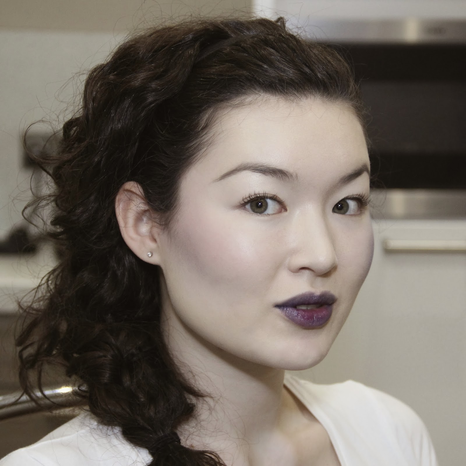
Needed to break up the block of text and calculations so here's a look I did with Inglot 363 and Sugarpill Bulletproof

Another caveat I'd like to add is Inglot eyeshadows are also cheaper than most indie eyeshadows:


  • A single Inglot eyeshadow is $7 for 2.7g = $2.59 per gram
  • Shiro's full size eyeshadow is $6 for 2g = $3 per gram
  • Fyrinnae's full size eyeshadow is $7.50 for 2g = $3.75 per gram
  • Notoriously Morbid's full size eyeshadow is $5.50 for "about 3g" = $1.83 per gram

All of these eyeshadows are loose except for Fyrinnae as they offer pan only pressed eyeshadows (which I thought would make a great comparison). I wanted to include more indies but a lot of them (Darling Girl, Femme Fatal etc) list their quantities by volume.


As always, love,

Saskia X


PS Don't expect another post for about a month as that's when I finish all my university exams! Sorry :(


Monday, 10 March 2014

Little Sparrow Cosmetics Mineral Blush Review

Little Sparrow Cosmetics is a new vegan focused indie brand on Etsy run by just one woman - Jessica! They're best know for their super moisturising Lip Jellies but last month came out with a new flower themed blush collection which you can view here. Although I would've loved to buy all seven of them because it's such a lovely and well rounded collection, I'm not made of money and would probably rarely wear the pink and orange ones anyway.

Quick disclaimer - I was given a blogger discount for this order which essentially just covered international shipping costs, I haven't been given free stuff, been paid to write this or even asked... although I think that's probably the point of a blogger discount!

Little Sparrow Cosmetics blushes in Lilac, Lavender and Bluebell

Little Sparrow Cosmetics' blushes are $8 each and contain 4-5g of product in a 20g jar with a sifter - the jars are study, don't leak, the shifter works very well to distribute useable amounts of product and, most importantly in my opinion, there is enough room in the pot and lid to swirl your brush so as to distribute product evenly amongst the bristles.

All the blushes have a matte finish and are incredibly finely milled with perfectly even pigment distribution so they apply quickly and easily as a smooth uniform wash of colour that can be built up in intensity.

Swatches in indirect sunlight in the same order as above: Lilac, Lavender and Bluebell

The strangest thing about these blushes is that when swatched Lilac looks lavender and Lavender looks lilac! I've swatched these blushes three times over the past few days double and triple checking that I've got them the right way around - they genuinely look exactly like the these swatch photos when applied with my finger over bare skin.

However, even more strangely when applied to my face the colours look exactly like they should based on their names and how they appear in the pot!

Lilac, Lavender, Bluebell

Below are lots of face swatches, and as well as the blushes I'm also wearing:

  • NARS Sheer Glow in Siberia foundation
  • Illamasqua Motto Brow Cake
  • Covergirl Clump Crusher mascara

I cleaned my brush (Real Techniques Blush brush) before switching colours to prevent mixing or muddying the colours, and all photos were taken in indirect sunlight with a diffused flash.

Lilac lightly applied.

Lilac translated to a very wearable cool pink on my face, leaning more pink than purple - it's an undeniably beautiful colour and a great formula. I'd recommend this to anyone who just wants to dip their toe into purple blush!

Lilac (unlike Lavender and Bluebell) is also safe to use on your eyes and lips which is a bonus if you like matching your blush to your lip colour (just add vaseline/some sort of lip balm) or even either to your eyeshadow, plus who doesn't love a versatile product?


Lavender moderately applied

I applied Lavender a heavier than I normally would for natural daytime blush to emphasise its colour. I love this blush - it's definitely purple, but if applied slightly sheerer than I have here would be incredibly wearable. I would recommend this colour to anyone who wants a basic everyday purple blush!


Bluebell lightly applied over Lilac lightly applied

Since I highly doubt I'll be wearing a blue blush by itself regularly I decided to try layering Bluebell over other blushes. Here you can see Bluebell over Lilac from above - it's clearly significantly changed the blush's original cool pink to a really lovely purple lilac. I was incredibly impressed with how evenly these blushes layered - there was no patchiness or caking and it took no extra time, effort or blending to achieve this smooth finish.


Bluebell lightly applied over Lavender moderately applied

Obviously this is very purple and probably isn't everyone's cup of tea, but I really can't praise these blushes' formula enough!


Bluebell lightly applied
(My lips are stained from Shiro's Sad Keanu that I was photographing for my last post)

Here I applied Bluebell very lightly to see if it would pass for a purple blush by itself - it obviously doesn't here on me as I was wearing a medium coverage yellow based foundation so there was no pink/red on my skin for the blue to mix with. Again, A+ formula.


Bluebell moderately applied
(I was multitasking and photographing my Shiro custom blue gloss for my last post at the same time)

Moderate Bluebell blush - it's definitely very blue and not for the faint of heart! I was also multitasking and photographing Shiro's custom blue lipgloss aka The Saskia, so you can ignore/admire my blue lips too.


Bluebell very lightly applied as contour under very pale pink Shu Umera blush lightly applied
(Again, ignore the blue lipgloss)

This is my absolute favourite - it's Bluebell used very lightly as a contour over a very light pink blush (Shu Uemura's M Pink 33E). Instead of the usual 'three shades darker than my skin colour' type contour I - and everyone else - uses it's turned the very natural pink blush lightly purple under my cheek bones giving me both a sculpted and perfectly natural blush.

I adore the effect and the fact that I'm wearing blue contour and it looks both beautiful and natural.

I'd recommend Bluebell to anyone who already has a few pink/red/plum blushes and wants to experiment with purples - one blue blush and you can transform the rest of your blushes into various shades of purple! Also anyone who wants to take their contour game to the next level, or is fond of the haute Smurf look.


Overall I could not be more impressed with Little Sparrow Cosmetic's blushes - they fill a niche in the market (matte lavender and blue blushes), are reasonably priced, are excellently packaged and come with great customer service, but most importantly are exceptional quality! I'd recommend them to anyone and really wish now I'd bought Desert Rose as it looks like an amazing neutral colour.


Also smug moment: I am literally the first person to review and swatch these blushes - I feel like a pro blogger now!


Saskia X

PrettyTrivialities@gmail.com
@aiksasarual on Instagram


Shiro Eyeshadow Swatches and Review

Shiro's one of the main players on the indie cosmetics scene and it's easy to see why - their creator and owner Caitlin has hit all the indie (or really general company) bull's eyes:

  • Amazing quality products
  • Inexpensive
  • Various sizing and pricing options (sample, mini, full)
  • Inexpensive shipping around the world
  • Relatively prompt turn around time
  • A relatively easy to navigate website (though I'd love the option to view her eyeshadows by colour family)
  • Wide variety of products
  • Clear swatch pictures for every product
  • Themed collections with adorable packaging
  • An active presence on social media (Colour of the Month suggestions and voting on facebook)
  • Custom products options (the lip glosses)
  • Great customer service (responds promptly to emails and is incredibly helpful)
  • Surprise complimentary eyeshadow samples with every order

Top: comparison of Shiro's sample, full and mini eyeshadow sizes; pound coin for scale
Botton: comparison of amount of eyeshadow in Shiro's mini and full size jars


I ordered:


Reading left to right: lip products, greenish eyeshadows, gold/neutral eyeshadows, purplish eyeshadows


Swatches and colour reviews of the purple eyeshadows:


Little Bird, Day of Reckoning, Equivalent Exchange, Task Force, Alkahestry, Master of Whispers, Mother of Dragons

Swatches are all done over NARS Smudgeproof Eyeshadow Base and the top half are also over Fyrinnae's Pixie Epoxy.

Little Bird, Day of Reckoning, Equivalent Exchange, Task Force


Little Bird is matte pastel pink toned burnt orange, it's significantly less pink and much more orange than on Shiro's website ("mauve beige/pink") and I'm really not seeing any mauve in it. It had a really nice smooth texture and excellent pigmentation, it applied just as well over regular eye primer as over a sticky base (as mattes tend to do). Personally I really dislike anything orange so this was a flop for me.


Day of Reckoning, Equivalent Exchange, Task Force


Day of Reckoning is a dark metallic almost black based burgundy, pretty much exactly as described and pictured on the website. I requested this colour as one of my complimentary samples.

Equivalent Exchange is a metallic steel grey with cool lavender undertones and almost imperceptible pink shimmer. It's much more grey and much less purple than shown on the website.

Task Force is very similar to Day of Reckoning but is brighter (no black base), more purple and less red and is the same warmth/coolness. They look very different in their baggies but when swatched are hard to tell apart, Shiro describes both as a metallic burgundy which it accurate but not helpful for distinguishing between the two. Personally I prefer Task Force to Day of Reckoning, and would re-buy it.

Alkahestry, Little Bird, Mother of Dragons


Alkahestry is a glitter bomb in the best possible way! Pale violet base is covered with bright turquoise sparkles, a bit gritty because of the glitter but exceptionally beautiful - it reminds me of faeries and spring, another favourite. Shiro's colour description and pictures were spot on, it required a sticky base to keep all the pigment and sparkles on. I'd definitely re-buy!

Master of Whispers is one of my favourite colours of all time - it has a lilac base with a cool pink and light yellow-gold shift, it's absolutely stunning and I've never seen anything like it. If you want a cooler version of Fyriannae's Rapunzel Had Extensions this would bit it (but better). Shiro's website photos doesn't do it justice - if I hadn't seen swatches of this online I wouldn't have bought it as it looks a boring sheer white pink, however the description "soft golden shimmer shining through pale lilac silk" is spot on. Perfect in every way, I'd recommend it to everyone!

Mother of Dragons was an anticipated disappointment - Shiro's website swatches make it look like the magical greyed purple with an ethereal silver blue shimmer ("silvered royal purple over a blood red base") that my dreams are made of, however all the blog swatches I saw of it online helped keep my expectations in check. In reality it's a hard colour to describe - there's a browned wine base reminiscent of half dried blood under cold metallic steel - it reminds me of a beautifully tragic battlefield scene full of blood and armour. Along with Master of Whispers it's a perfect representation of the respective Game of Thrones characters, just not the colour I would have wanted - the artwork is spectacular though and I have no regrets!


Lingered in Twilight, Farore's Wind, Maiden Queen, Steve, You Know Nothing

Onto the green eyeshadows; remember all swatches are done over NARS Smudgeproof Eyeshadow Base, and also over Fyrinnae Pixie Epoxy in the top half of the swatches.

Lingered In Twilight - the colour shows up best in the below photo pre-tape removal, as because it's so dark in comparison to the other shadows (and my skin) has come out underexposed in all my other photos. It's a matte black base with intense metallic emerald shimmer, there may be a touch of blue in the shimmer as the green is very cool with no warm tones. Love it, but my photos don't do it justice unfortunately.

Farore's Wind isn't quite what I was expecting but is still very nice, Shiro describes it as "light blue-toned green with silvery shimmer". From that description and the photo on the website I was expecting an aqua leaning mint green but it's both less blue and less pastel than I was expecting, however does have a high silver shimmer content. I have no idea who 'Farore' is but the artwork shows some sort of faerie which I'd safely say is very appropriate for this colour.

Maiden Queen is the perfect bright mint green with equal green and blue tones, and a lot of shimmer which appears to be a mixture between aqua and gold giving an overall mint light reflection. Of all the green shadows it adhered and lasted best to the primer only section of my skin, as well as obviously doing faultlessly over Pixie Epoxy too. A truly lovely colour and I almost wish I'd gone for the full size as the character artwork was my favourite after Mother of Dragons, but to be honest this isn't a colour I can see myself wearing a lot.

Steve is a complimentary sample from Shiro that they picked out for me, this in itself impressed me as it ties so nicely into the shadows I've already ordered. It's a bright shimmery turquoise just as Shiro described it, less metallic than Farore's Wind but more so than Maiden Queen.

You Know Nothing is my third and final complimentary sample that Shiro also picked out for me, it's a matte white base with lots of aqua shimmer - I'm not seeing the "wintery grey-white" Shiro claims but there is definitely lots of "bright icy shimmer!" It's a nice twist on a pale highlighter shade and is almost like Little Bird's less exciting brother. Again, I'm impressed with Shiro's choice as it really suits the rest of the shadows and is from the Seven Kingdoms collection which is clearly my favourite.

Lingered in Twilight, Farore's Wind, Maiden Queen, Steve, You Know Nothing

And finally the gold and neutral shadows! Again, everything over NARS Smudgeproof Eyeshadow Base and the top half over Fyrinnae's Pixie Epoxy. I swatched No Men Like Me twice because the first time came out pretty meh, so I foiled a new swatch of it.


Climbing Chaos, I Loved A Maid, No Men Like Me, Hordor, No Men Like Me Part 2

Climbing Chaos is a lovely blackened bronze/gold, it has a high shimmer and it's sparkles at first seem colourless but upon closer inspection are almost holographic adding a wonderful but fairly subtle twist. It works fine without Pixie Epoxy but is less dark and sparkly. It's close to the photos on Shiro's website but is much less warm than described there.

Climbing Chaos rainbow sparkles, I Loved A Maid green sparkles


I Loved A Maid no where near as peachy as it appears on Shiro's website, but the description is pretty apt if you take "softened Lannister crimson" to mean burnt red-orange. It certainly has green sparkles but I'm honestly not seeing a lot of gold. It's interesting, but not what I expected nor a colour I personally like.


Hordor, No Men Like Me


No Men Like Me is both glorious and very annoying - as you can see from the first failed swatch above you can neither apply it just over eyeshadow primer or you'll end up with a flat, dull grey matte, nor can you just pat it on over Pixie Epoxy or it'll go as patchy as Elmer the Elephant.

However if you foil it over wet Pixie Epoxy (or I assume with water/sealant) it becomes an amazing almost matte gold. As gold is an inherently metallic colour a truly matte gold would just be a dull shade of yellow, No Men Like Me is not that - it's metallic without the shimmer or sparkles. It's definitely a very interesting and unique colour and is well work the extra effort. I'd love to know how Shiro got their swatches to look like they do on the website - a very pale matte ashy gold - though.

My favourite element of it though is a very, very subtle rainbow glow to it - it is neither a shimmer nor a sparkle, but a glow like like real gold would have at sunset. Or what I imagine a pregnant lady's glow would look like...


Hordor, No Men Like Me

Hordor is exactly as described: "medium near-matte taupe." It's a cooler taupe when swatched over Pixie Epoxy and a warmer taupe over primer alone, it's nice and soft and overall a lovely neutral colour. I discovered something slightly exciting about it when I was trying to capture No Men Like Me's pregnancy glow - a very light dusting of rainbow glimmer that you can see above, it's not obvious, but it's there like some naughty multicoloured secret in the otherwise sober taupe.


And finally the lip products Sad Keanu and the Custom Lipgloss aka The Saskia... You can check out tons of swatches and full reviews of them on my last blog post here!


Overall I absolutely love everything I've bought from Shiro, somethings were not exactly as I expected or quite to my taste but I can't fault the gorgeous colours, finishes and most of all astounding quality and customer service.

I would 100% recommend Shiro to anyone looking to try out indies for the first time, anyone who would appreciate the themed collections, anyone looking for something unique and a custom order, or really anyone looking to expand their collection with unusual colours - $1 samples are a great way to experiment!


Things I want for next time:


  • Custom medium opacity gloss in Master of Whispers
  • Full sized Task Force
  • Full sized Alkahastry, maybe
  • The entire full sized Seven Kingdoms collection because it's perfect in every way and I love the artwork (oh if only money was not limiting factor)
  • A bunch more colours I'm sure I'll find browsing the website


Saskia X

PrettyTrivialities@gmail.com
@aiksasarual on Instagram

Thursday, 6 March 2014

Complete Sugarpill Pressed Eyeshadow Swatches and Mini Review

I love Sugarpill for the very simple reason that they make the best quality bright, matte, opaque and long lasting eye shadows out there. Here's an in depth review of the Burning Heart palette I wrote last year.

So without further ado here are swatches of every pressed eyeshadow Sugarpill currently sells:

Swatches were done with a clean finger over bare skin and the photos were taken in indirect sunlight

Matte shades: Love+, Flamepoint, Buttercupcake, Acidberry, Midori, Mochi, Afterparty, Velocity, Poison Plum, 2AM, Dollipop, Tako and Bulletproof.

Metallic shades: Subterranean, Elemental Chaos, Diamond Eyes and Soot & Stars.

The only shadow that didn't feel buttery smooth and apply perfectly evenly and opaque was 2AM - it was slightly more sheer and less smooth overall.

Here's how they look in my face: 

I couldn't decide which lipstick would go best with this look :( Here's

Sugarpill Elemental Chaos from the Cold Chemistry palette and Bulletproof, as well as Inglot 363 eyeshadow and Illamasqua Static pigment. I actually had trouble building Elemental Chaos up to full opacity so I packed it on over Fyrianne's Pixie Epoxy.


And here's a sneak peek of a project I've been working on which uses Buttercupcake, Love+ and Poison Plum from the Burning Heart palette.


Products are the same as they always are, with the obvious exception being the Sugarpill eyeshadow's I'm reviewing. Lashes are Red Cherry #43 in both photos and the flower petals are stuck on with Duo eyelash glue.

Obviously, I highly recommend Sugarpill to anyone who wants to get their colour on! And if you're considering buying from them it'd be awesome if you could use my affiliate link here, it'll just take you to their regular official website and if you buy anything I'll get credit!


Saskia X

PrettyTrivialities@gmail.com

Sunday, 23 February 2014

MAC Heroine review

I recently acquired Mac's newly permanent Heroine matte lipstick - a bright orchid purple, or violet leaning fuchsia, which I've speedily swatched next to other similarly coloured lipsticks I own:

Taken in indirect sunlight, as swatch photos should be!

  • Top left: Maybelline Colour Elixir Lip Gloss in Vision in Violet
  • Top right: Revlon Matte Balm Stain in Shameless
  • Centre: MAC Heroine matte lipstick
  • Bottom left: OCC Lip Tar in Hoochie liquid lipstick
  • Bottom right: MAC Flat Out Fabulous retro matte lipstick


I'm not going to describe the differences between these varying shades of purple as the above photo gives an extremely accurate colour reference, but I will say that Heroine is not as opaque as I'd hoped and expected it to be. Since I'm insanely pale and without strongly pigmented lips it's rare that lipsticks allow my natural lip colour to peep though (unless of course they're a deliberately sheer formula) and to be honest Heroine is only slightly less than fully opaque - I just expect better from MAC.

Not going to lie - I can't wink, but neither am I going to let that stop me

Since I have no time in my life right now for neat on-the-mouth swatches in daylight (I live in the library during the hours the sun is out) I'm just going to leave you with some snaps of the makeup I did for an event I attended this weekend - as the photo was taken at night under my stupid eco-friendly energy saving lights the colours are naturally slightly off - suffice to say Heroine is the colour shown above on the swatches, not how it appears here on my mouth.


Overall I'd give Heroine a B+ - it was adequately opaque, applied well straight from the tube, was matte enough to be very long-wearing yet also comfortable without patchiness. It did however leave a significant bright pink stain which doesn't bother me in the slightest but is probably something to consider. I'd definitely re-buy it if I lost or finished it because it's such a gorgeous colour and easy to use, but hopefully there's something a little bit better out there!


FACE:

  • NARS Oil Free Primer
  • NARS Sheer Glow in Siberia foundation
  • Illamasqua Hollow contour
  • Illamasqua Delirium blush
  • Illamasqua Concealer in 105 and 115
  • Laura Mercier Translucent Setting Powder

BROWS:
  • Illamasqua Motto Brow Cake
  • Sugarpill Bulletproof eyeshadow

EYES:
  • NARS and Urban Decay eyeshadow primer (one on each eye - literally no difference)
  • Laura Mercier Morning Dew eyeshadow
  • Inglot 363 eyeshadow (my absolute favourite crease colour)
  • Fyrinnae Pixie Epoxy
  • Fyrinnae Serendipity and Rapunzel Had Extensions eyeshadow
  • Sugarpill Bulletproof eyeshadow
  • Urban Decay Perversion eyeliner
  • Oh My Lash Lucille eyelashes
  • Duo Lash Glue
  • Misc rhinestones from Amazon

LIPS:
  • MAC Prep+Prime Lips
  • MAC Heroine lipstick

This feels invasively close


Also here's my other and all time favourite purple lipstick, also by MAC but sadly Limited Edition - Instigator:

Hair's still wet, no one to impress


All FACE and BROW products are exactly the same as above.

EYES:

  • NARS Smudgeproof Shadow Base
  • Laura Mercier Morning Dew
  • Inglot 363 eyeshadow
  • Sugarpill Bulletproof eyeshadow
  • Urban Decay Pervesion eyeliner
  • Red Cherry #48 eyelashes

LIPS:
  • MAC Instigator


Hopefully soon I'll find time in my life to post more than just a few snaps of looks I've done for nights out, but until then I'll be living barefaced in the library.


Saskia X

PrettyTrivialities@gmail.com